VITRU WATER – Brand Guide
CREATING
A BRAND
IDENTITY
FOR
VITRU
WATER.
VITRU
WHAT
NOW?
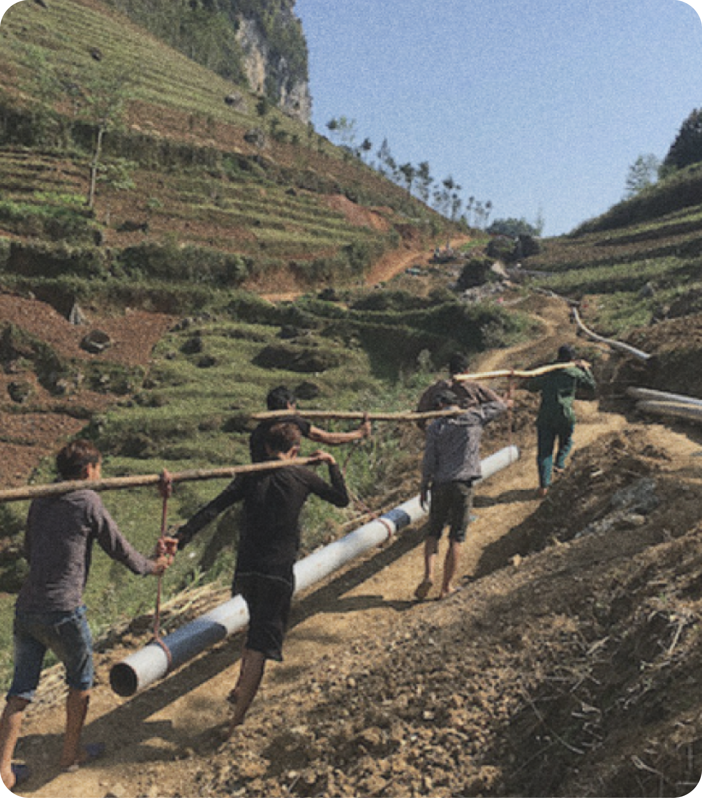
Vitru Water is dedicated to providing reliable, sustainable water solutions to underserved communities worldwide. Inspired by the principles of Roman engineer Marcus Vitruvius, the company focuses on developing frugal, efficient water distribution systems that combine ancient engineering techniques with modern technology. Their mission is to address water scarcity in a sustainable manner, ensuring access to clean water for all, particularly in regions where resources are limited. Vitru Water’s projects are designed to have a lasting positive impact on both the environment and local communities.
Inspired by the principles of Roman engineer Marcus Vitruvius, the company focuses on developing frugal, efficient water distribution systems that combine ancient engineering techniques with modern technology.
Their mission is to address water scarcity in a sustainable manner, ensuring access to clean water for all, particularly in regions where resources are limited. Vitru Water’s projects are designed to have a lasting positive impact on both the environment and local communities.
DROPPED
ON THE
SPOT
Vitru Water’s technical concept is built around a sustainable water distribution system that prioritizes efficiency and minimal maintenance. Using renewable energy and locally sourced materials, the system is designed for resource-limited environments, ensuring reliable access to clean water with a low environmental footprint. Tested in real-world conditions, such as pilot projects, it has proven to be a resilient and cost-effective solution for delivering clean water to underserved communities.
WEATHER
OR DROP?
WORK
SHOP.
We took a dive into the depths of Vitru Water’s brand identity, navigating through the currents of archetypes to discover the unique essence that would make waves in the water world. Our workshop wasn’t just a casual dip—it was a full immersion. With every exercise, we sifted through ideas, filtered out clichés, and let the core rise to the surface: forward-thinking. It’s the drive to flow ahead, adapt, and innovate that sets Vitru Water apart, embodying a vision that never sits still, just like the water it so expertly redirects.
GUIDED
FROM
THE FIRST
DROP
To gulp down the full brand discovery filled with twists and turns all you need to do is keep scrolling. If that makes you sweat you can just click the button below to the end of the story – but that is really like walking around the waterslide and entering the pool like an old lady, isn’t it?
THAT’S
ONE LIQUID
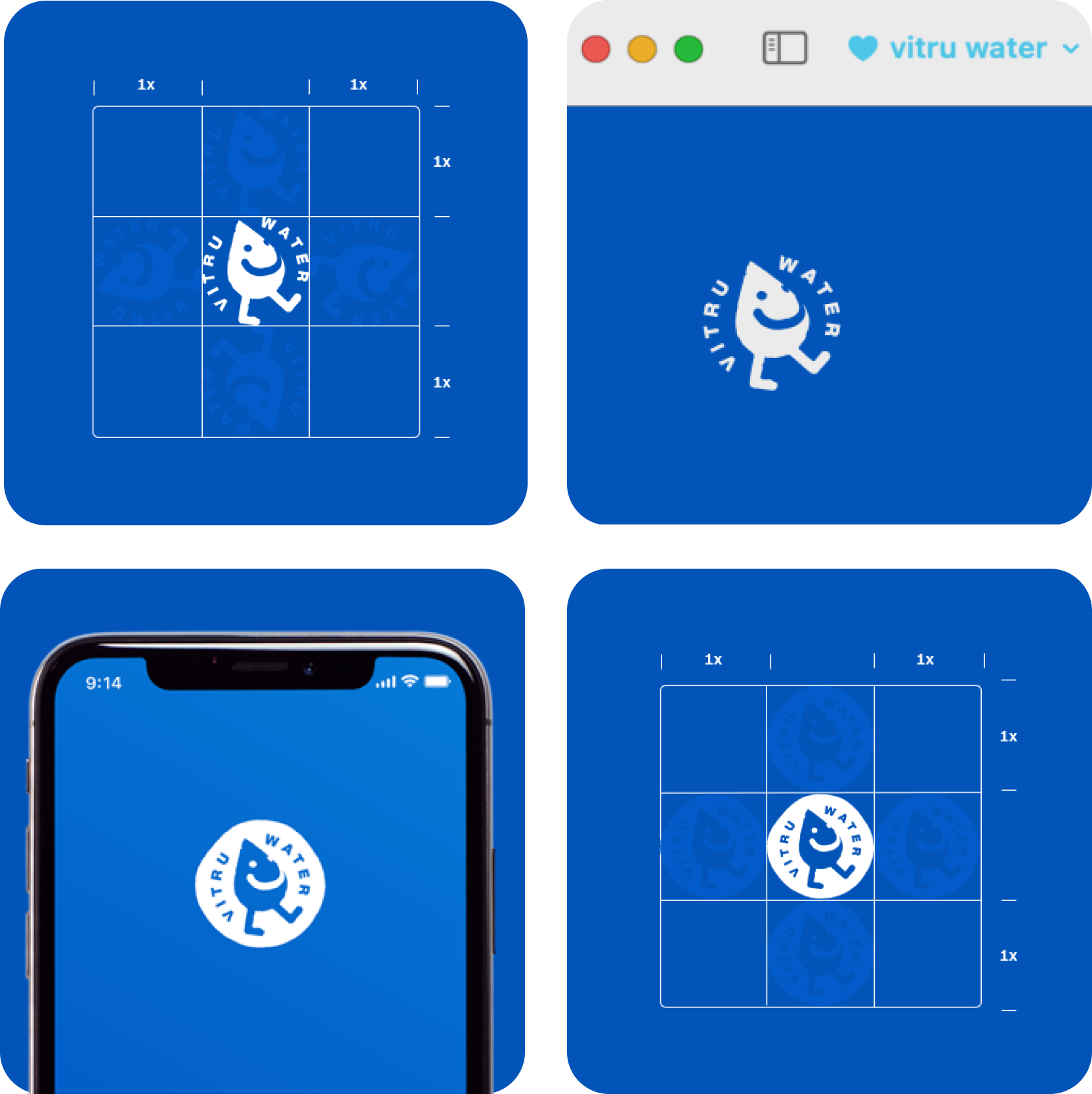
LOGO
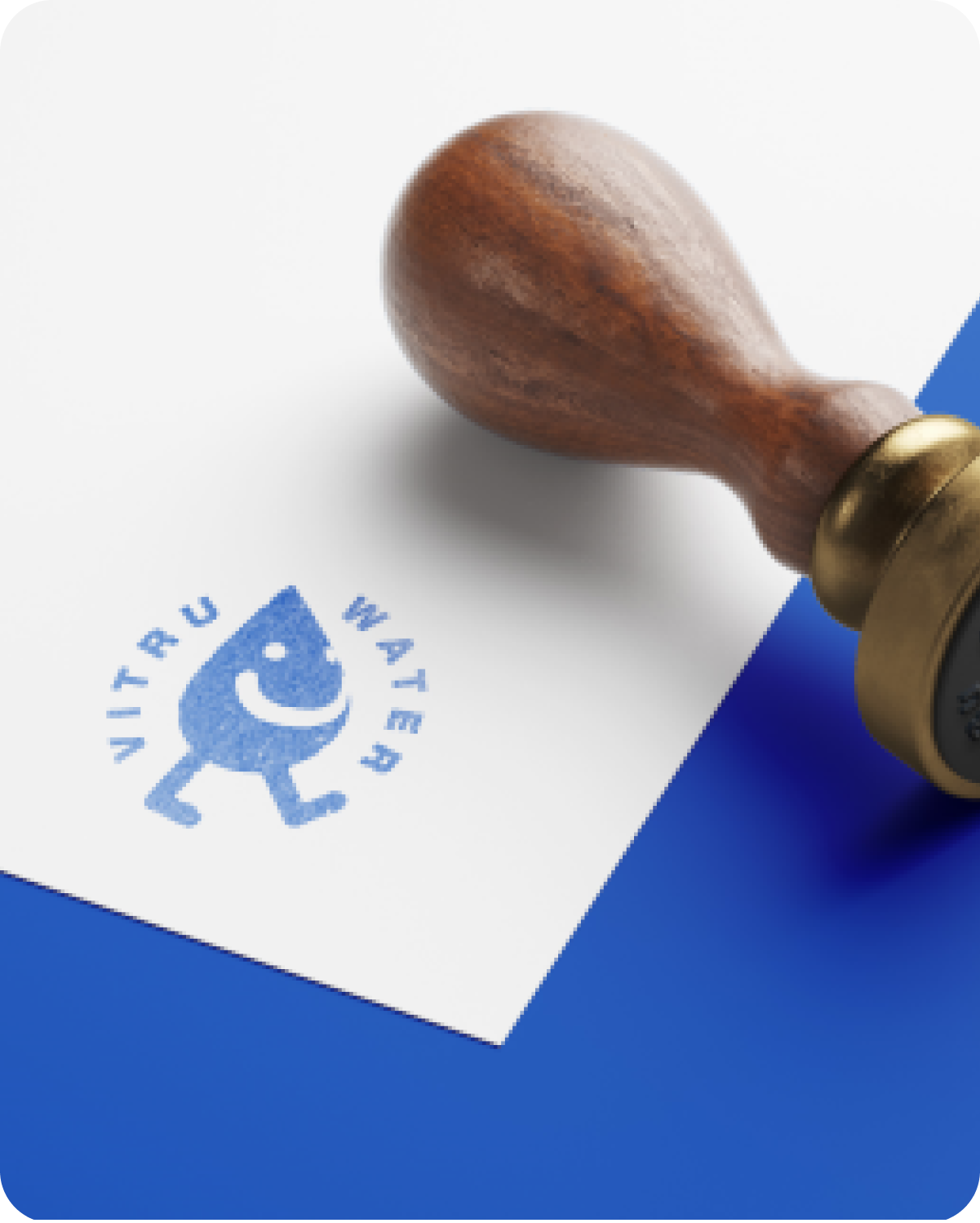
Well, if we count colours its two, actually. And there is a Seal version of each one. So four in reality – solid! But the headline flows way better this way, doesn’t it?
WHEN THE
GLASS IS ONLY
HALF FULL
Co-Branding
Vitru Water loves working with others to create a positive impact—and that includes sharing the spotlight! In co-branded collaborations, Vitru Water’s logo doesn’t stand alone; instead, it’s designed to harmonize right alongside its partners.
Co-Ruling
To keep everything flowing just right, Vitru Water’s logo maintains a balanced size ratio of 0.75x the height of its partner’s logo, with a bit of padding (0.125x) at the top and bottom. For logos with a less symmetrical design, adjustments can be made to achieve an eye-pleasing balance. But remember: no drifting outside those boundary lines—Vitru Water’s brand has its limits!
GERMAN ENGINEERS
START WITH SOLID
FONT WORK
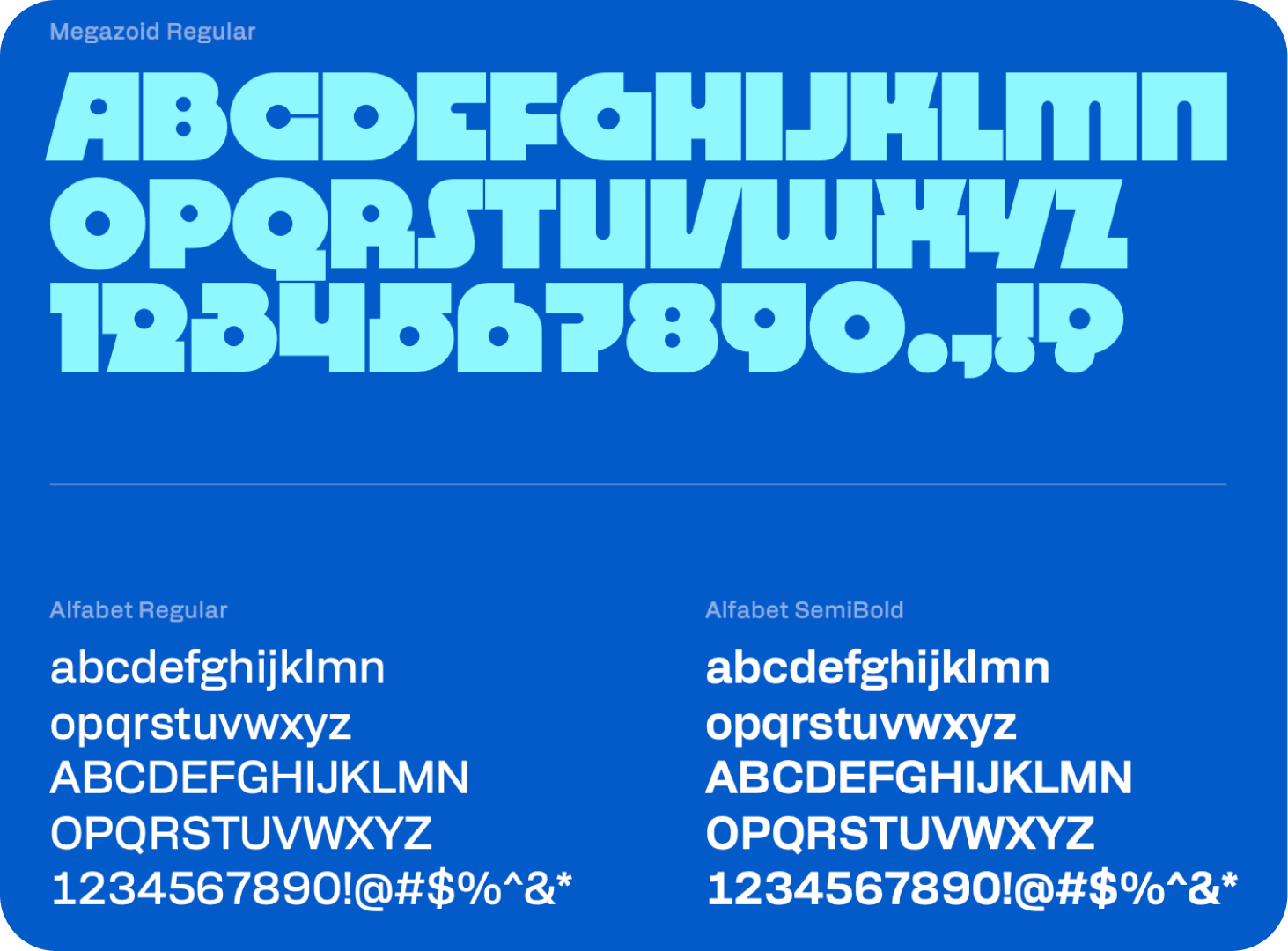
Vitru Water’s choice for bold, info-packed headlines is DRJ’s Megazoid—a raw, geometric sans-serif font with blocky and circular shapes that evoke the strength of industrial building blocks. Megazoid makes a mighty splash in short, impactful statements.
For body text, Vitru Water uses Alfabet in Regular and SemiBold weights, offering a digital twist that complements Megazoid’s engineering vibe. This pairing keeps Vitru Water’s message as clear and precise as its mission.
TWO
WORDS:
WATER
COLOR.
Vitru Water, just like Non-Vitru Water (aka Water) comes in different colors. Since we deal in something that should be an obvious commodity, our design agency thought they could bring some of that obviousness into our brand. And honestly – it just works.
If you are into fan fiction, you should really check out the full color adventure in the complete brand manual, which you can dowload to your favourite eReader.
LET.
US.
LAY.
IT.
OUT.
FOR.
YOU.
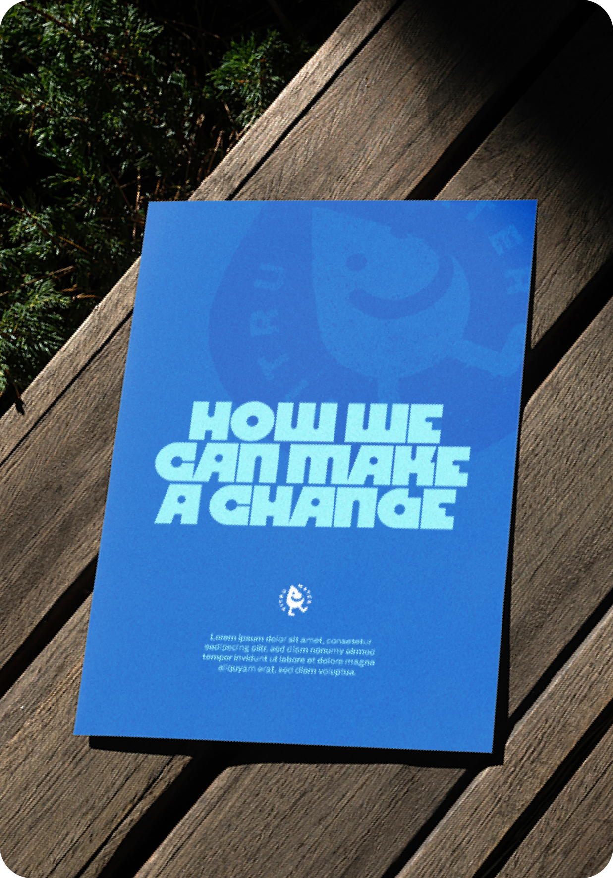
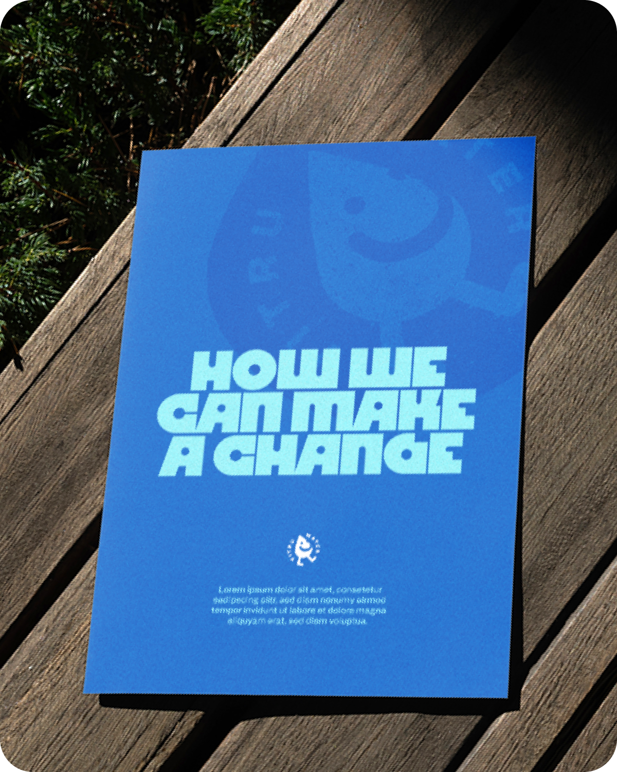
When it comes to layouts, Vitru Water likes to keep things refreshingly clear and fluid. Bold headlines take the lead, guiding the flow, while concise, technical descriptions offer substance without flooding the space. Images drift seamlessly alongside text, either in full-color to add depth or stylized to create abstract backdrops. Each layout balances clean lines with a splash of personality, ensuring that every piece flows in harmony—whether it’s diving into technical details or floating on a visual wave.
Exciting new innovations are flowing our way as Vitru Water continues to push boundaries in sustainable water solutions. With each project, we’re just getting started—so stay tuned, because when it rains, it pours.
from our
bubble
TO YOUR
CLOUD.
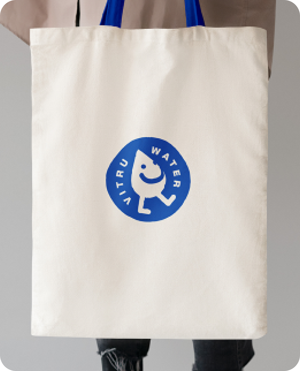
Our brand guide for Vitru Water serves as the pool of tools for an ocean of possible applications – be that print layouts, merchandise, digital experience & more. Great ideas are really falling from the sky sometimes. Download the brand guide – even if just to store it in your own personal cloud for a rainy day.

